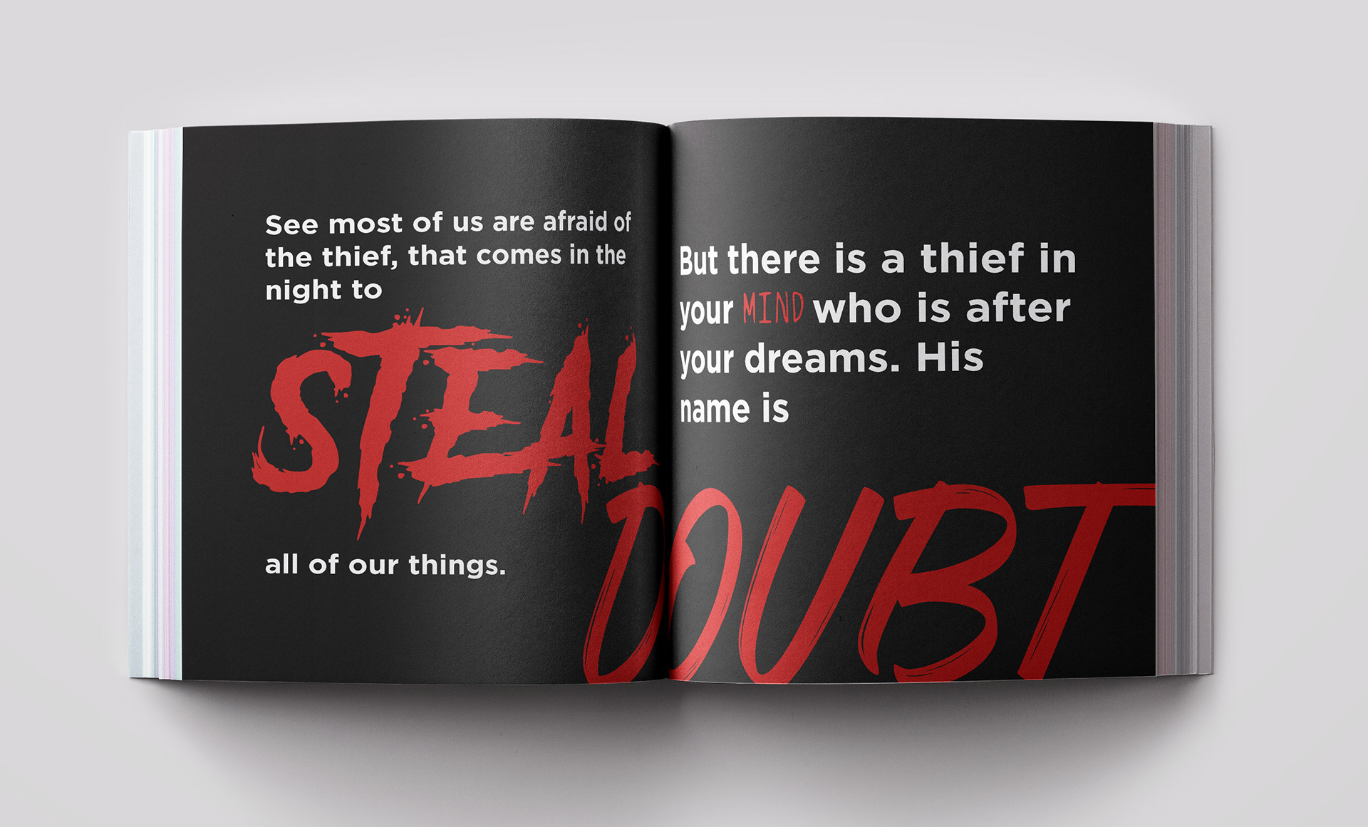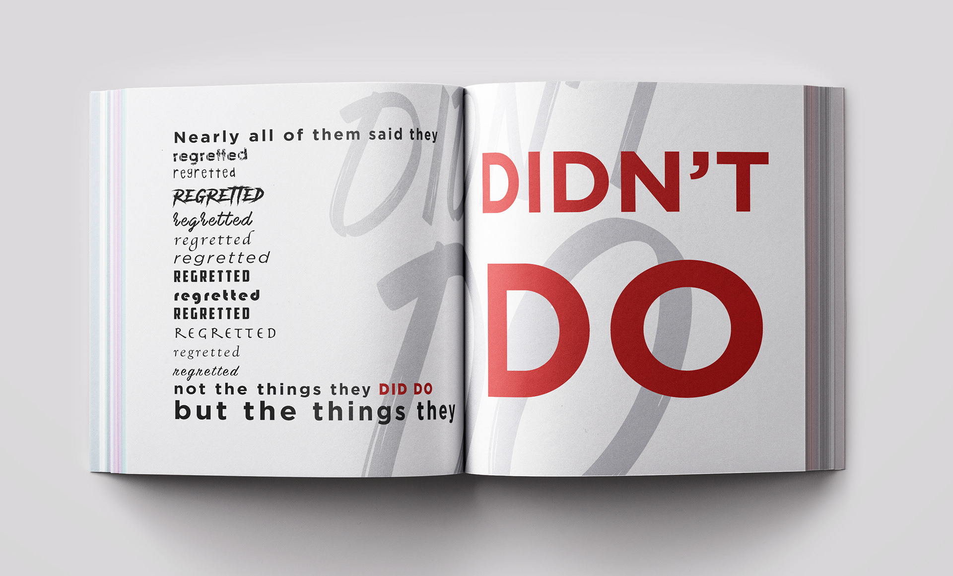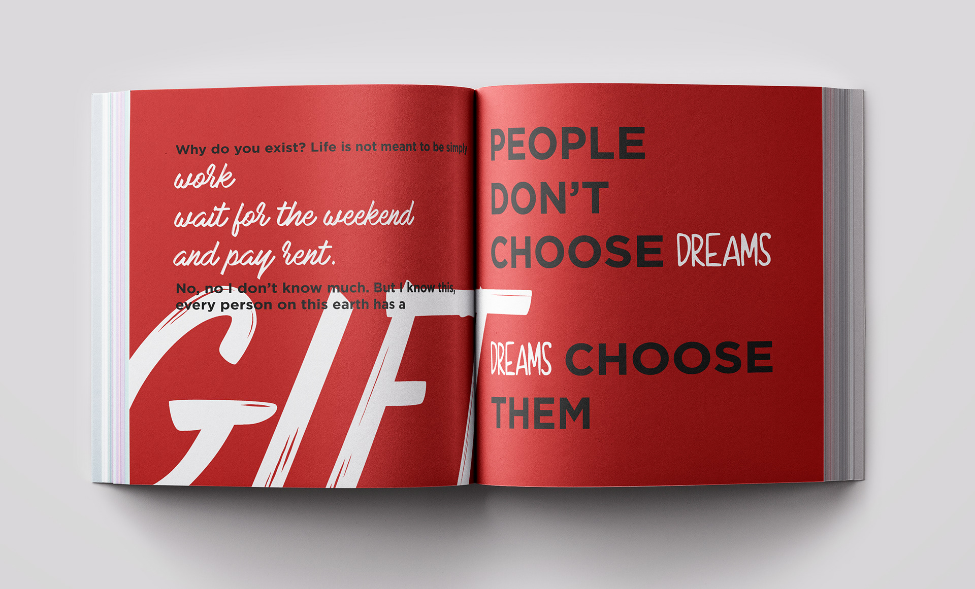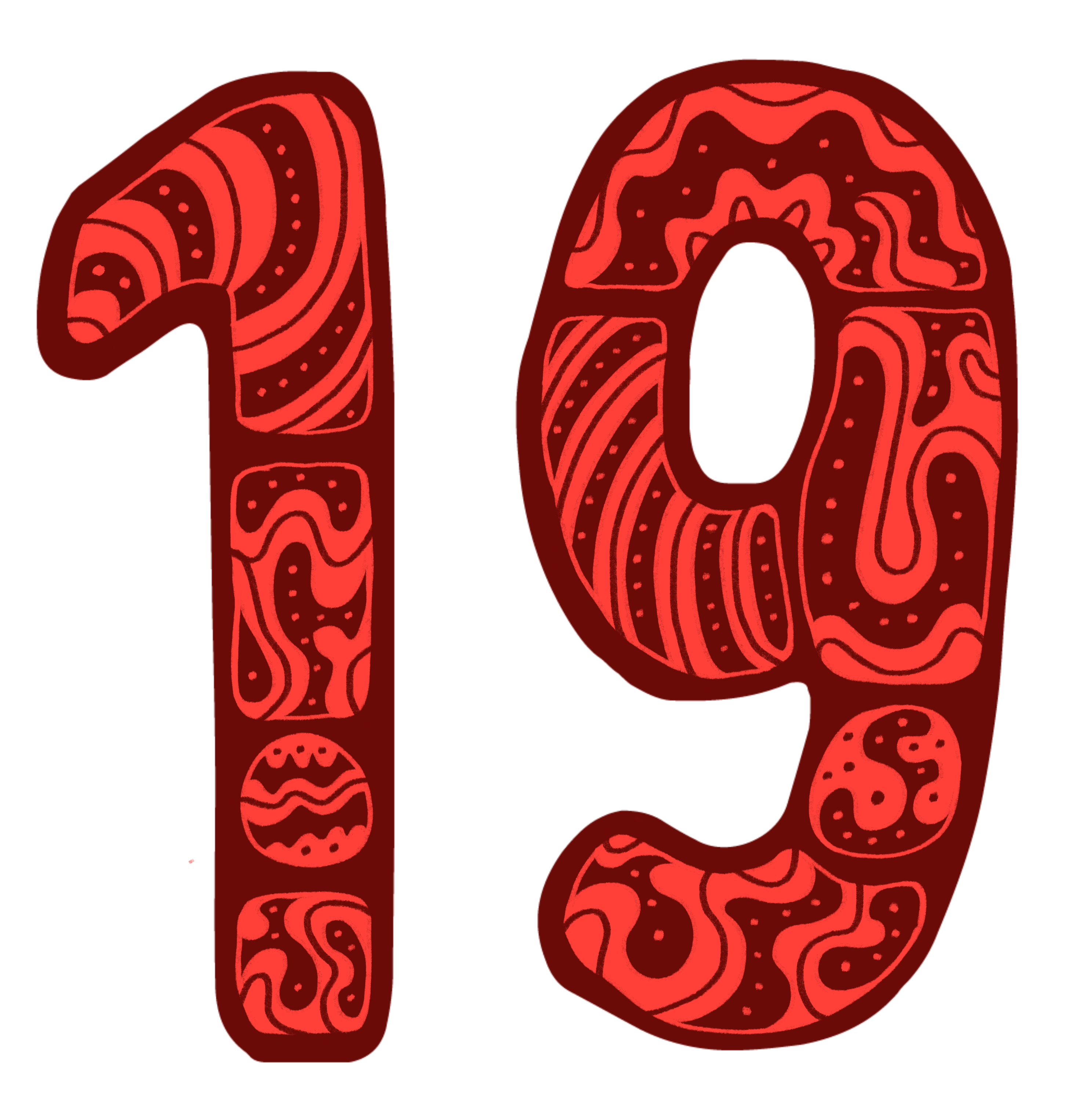
The goal of this project was to introduce type as a graphic element to showcase a short story about people. It addresses the idea that no matter what you do in life everyone will die eventually, but not everyone will truly live a full and happy life. I decided to take that core idea and twist it slightly. Instead of making shape-based graphic elements to illustrate the book, I focused on the correlation between the context of the story being told and how different typefaces could convey the essence of the narrative. For example, I use typefaces such as slab serif type (Gotham) when the story gets intense, or animated ‘scary’ style type (Another Danger) for when the story gets dramatic. Since typographic visualization was the focus, I kept my color palette simple and only introduce one color (red) beside black and white in each layout. By doing that the viewer focuses on the context of story “Everyone Dies, But Not Everyone Lives” by Prince Era.