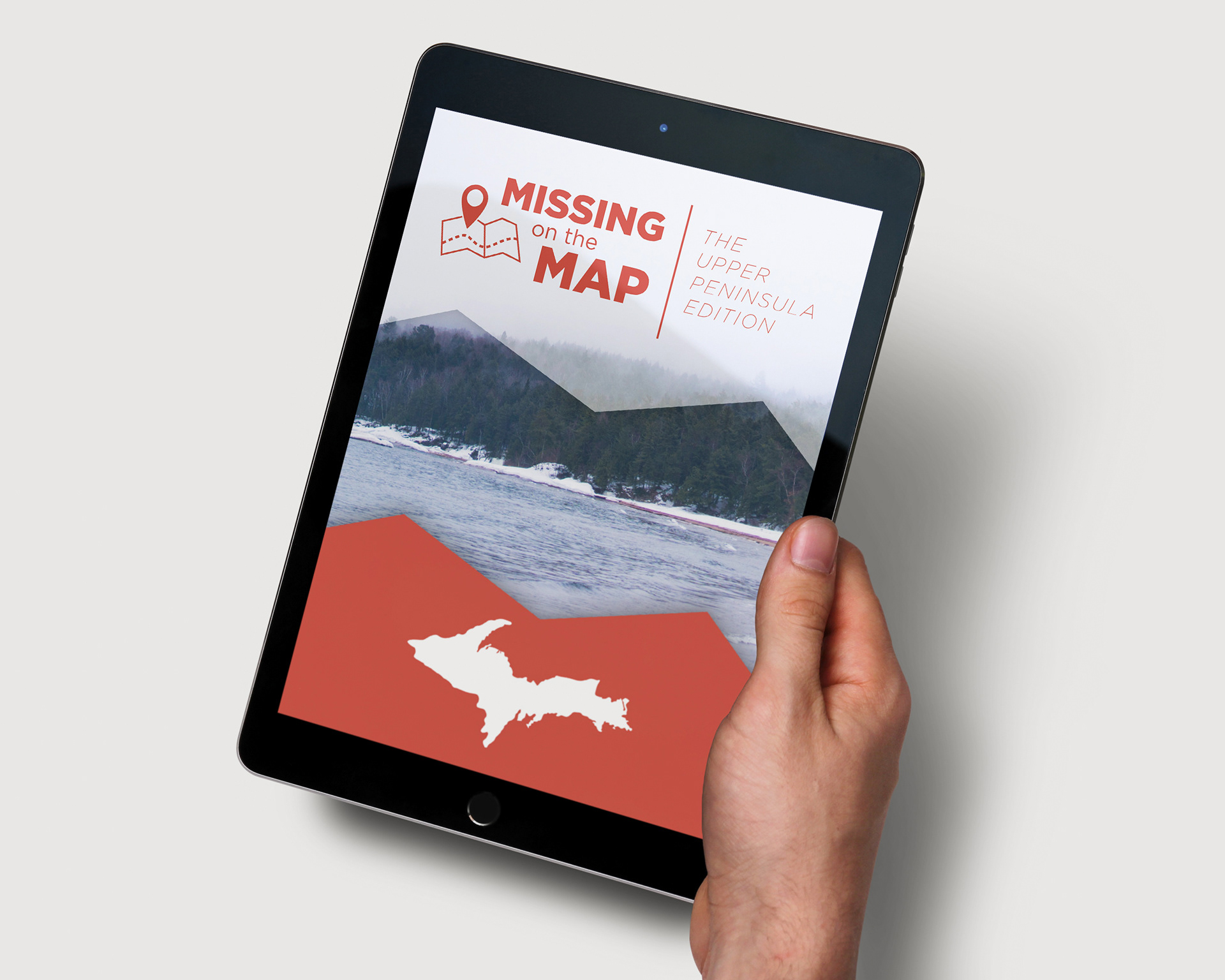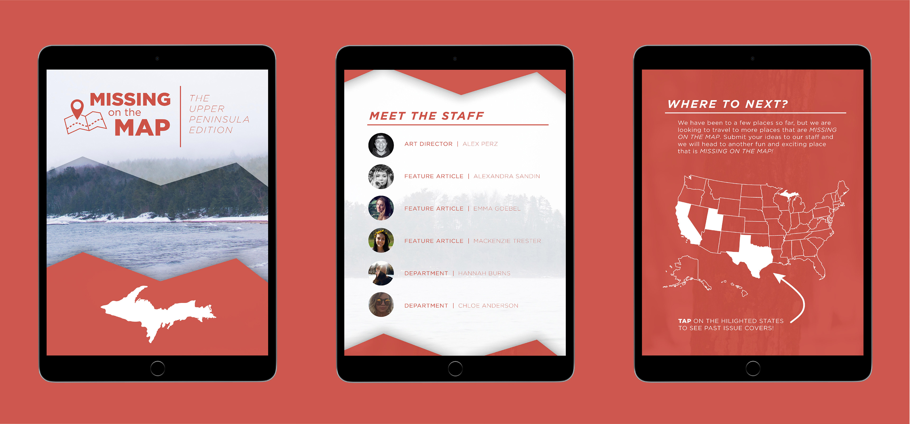

The goal was to conceptualize an idea for a group magazine project that would be displayed as a digital publication. Our group’s concept was a magazine about places around the U.P. that people who were not from the U.P. would be less likely to know about. For example, the Ore Dock or the Portage Lake Lift Bridge. Since the page layout was for a scrolling page design, I created a background structure alternating between a red hue and white to help the viewer distinguish the start of a new section. I also made the page break into a graphic element—a jagged horizontal line starting higher on the left and lower on the right to keep the viewer continuously engaged. This allows the viewer to see the information and subsequently see the content sections more holistically. The background imagery used in the magazine was inspired by a photographer named Peter McKinnon who often uses desaturated imagery and features unique travel destinations.